Tokyo (SCCIJ) – Monotype, the world’s oldest type company, has refreshed the world’s most iconic Swiss font Helvetica for the digital age. Helvetica became a symbol of modern, minimalist design from the start. The sans-serif typeface was developed in 1956 by the Swiss designer Max Miedinger and the businessman Eduard Hoffmann and last updated in 1983 as “New Helvetica”.
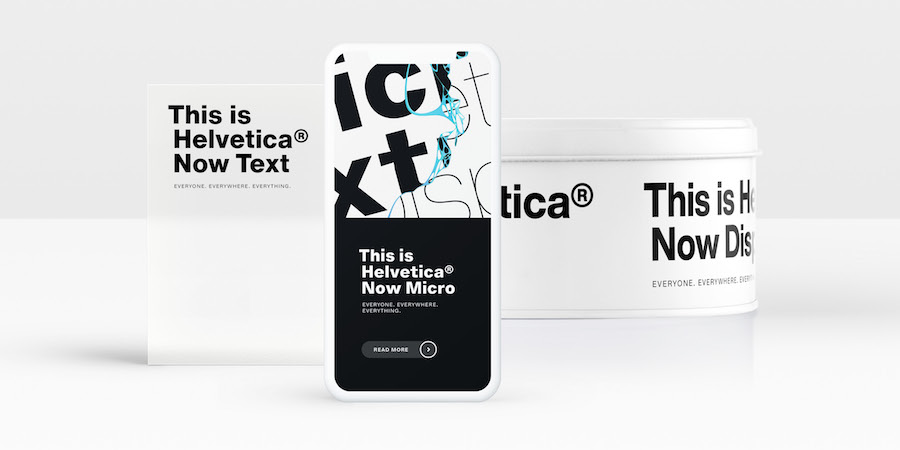
New typeface Helvetica Now comes in a micro, text and display version
Ubiquitous typeface
Today, it is one of the most widely used fonts in the world, also appearing in many enterprise names such as Nestlé, Panasonic and Lufthansa. However, due to e-mails and the spread of Windows’ Microsoft Word, Helvetica has been overtaken by Arial.
One reason: Since the last Helvetica update, the technical conditions in print shops and the spread of the internet altered the demands for a typeface. Also, many new signs and letters that did not previously exist are now used daily.
“At that time there was an ideal font size of eight or nine points. Today, high-resolution retina screens are used to display much smaller font sizes of four or five points. There the old Helvetica has significant deficits,” Hendrik Weber, one of the monotype designers in Berlin, explained in an interview.
“At poster size, we call it the display, it still looks very charismatic. However, on a small scale, we say micro, it is difficult to read. It was simply a heart project for us to preserve this valuable typeface and make it attractive again for young designers,” the designer added.
Two-year team effort
“Helvetica Now” resulted from the two-year long collaboration of dozens of designers and engineers in the monotype studio. With 48 weights and three optical sizes (micro, text, display), the font family offers size-dependent letterforms and metrics for the first time.
According to Monotype, the optical sizes Micro, Text and Display eliminate elementary weaknesses of Helvetica’s predecessor. Micro, for example, removes the decades-long lack of spacing and legibility in tiny texts, such as footnotes.
The new character set also makes longer middle lengths and more open shapes possible. Helvetica Now Display, on the other hand, is designed to create texts with font sizes from 14 points upwards easier to read. Monotype promises to reduce character spacing or screw on the kerning.
Almost 40,000 characters
The team redrew every single letter and created 500 original signs and symbols like accents, arrows, and numbers. “We asked ourselves: What do designers need today to design with this typeface? Now they can replace the square dots in letters and punctuation marks with round dots. There are numbers on circular surfaces and in rings, for example for guidance systems,” designer Weber explained.
Another excellent example for the qualities of Helvetica Now is the character @. “This character did not exist before, and it was inserted generically from another font. It’s a very complex character, it happens a lot in a small space,” Alexander Roth, another monotype designer in Berlin involved in the redesign, said.
The Helvetica Now family comprises a total of almost 40,000 characters and is available at a starting price of 299 euros. If you want to test the new classic typeface, you can download Helvetica Now Display Black free of charge until July 8, 2019.
Text: Martin Fritz for SCCIJ; Photo: © Monotype.